2011 Interior Colour Trends
Our previous blog post focused on colour selection and offered some tools to help you choose the best hues for your space. At White Knight Painting, we believe that it’s also important to stay up to date on the latest design trends. In doing so, we are able to provide informed advice when you are selecting home or office colours. Here are some of our favourite interior colour trends for 2011:
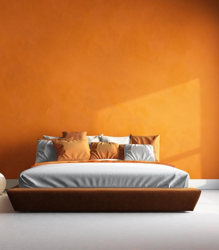
Benjamin Moore’s colour designers have predicted that 2011’s colour of the year will be Vintage Wine (2116-20). According to Benjamin Moore, vintage wine was “first seen on the fashion runways of New York, Paris, and Milan. This rich hue with a deep brown base and a hint of smoky violet is just as magnificent in the home. As an undertone in many of the latest wood finishes, leathers, and other textiles, vintage wine and its lighter variations will make a great paint color pick for many applications over the coming years.”
For an eye-catching effect, use saturated royal hues such as vintage wine alongside subtle or muted hues such as Hush (AF-95) and Wasabi (AF-430).
Benjamin Moore’s Envision Colour™ tool outlines their predictions 2011’s most popular colours and colour combinations.
Benjamin Moore has also conveniently put together five colour combinations that are perfect for welcoming spring. According to Benjamin Moore, “these carefully chosen palettes are sure to put a ‘spring’ in your step.”

First Signs of Spring
calm (OC-22), castleton mist (HC-1), horizon gray (2141-50)
A harbinger of spring, this soothing, sophisticated palette evokes a gardener’s eager anticipation as the season’s first seedlings pierce the winter landscape.
Spring in Full Swing
agave (AF-420), eternity (AF-695), solitude (AF-545)
Evoking freshness with sophistication, this modern, muted palette pairs a pop of spring green with the depth of a smoky blue sky.
Spring Twist
ivory tower (2157-70), coral essence (2007-40), beeswax (2157-40)
For a vibrant twist, this cheerful, colour-charged palette captures the playful essence of spring in full bloom.
Springtime in Paris
white dove (OC-17), sea life (2118-40), bird’s egg (2051-60)
Spring’s stylish and sophisticated side is revealed in this eclectic, modern pairing anchored by sea life, a chalky purple-gray reminiscent of a stroll along the Seine.
Sail Into Spring
provence crème (2021-60), mysterious (AF-565), frostine (AF-5)
Chart a fresh course for a living space with this maritime-inspired combination that suggests crisp spring breezes and calm seas.
(Credit: Benjamin Moore’s Spring Colour Combinations)
Even the most inspired colour combinations need professional application. Not only can White Knight Painting guide you through the colour selection process with an interior colour consultation, but we will make sure that the hues are expertly applied by our craftsmen. Our team of experienced, certified and trained painters will protect and beautify your space, leaving you free to enjoy it.
White Knight Painting doesn’t stop at interiors, though. We can provide an exterior colour consultation (house colour consultation) to give you the best advice on making your house look great from the outside in. Our next blog post will focus on 2011’s exterior colour trends and house colour trends.